
Pink Wall Art for Grown-Ups: Elegant, Moody, and Bold Styles
What Defines Pink Wall Art for Grown-Ups
Pink wall art for adults requires a deliberate focus on tone, composition, and curatorial intent. Modern collectors leave behind the overly bright, highly saturated, or playful shades of childhood. Instead, sophisticated interiors demand muted pink tones, dusty blush, vintage rose, and deeper architectural hues. Mature wall art relies heavily on visual balance. Rather than acting as loud, temporary decor, sophisticated pink art integrates seamlessly into a space without overpowering the existing design language. This maturity demands clean compositions, highly controlled color palettes, and thoughtful, evocative subject matter.
Pink also plays a critical role in an emotional art collection, softening hard architectural surfaces, infusing stark neutral spaces with necessary warmth, and creating a profound sense of calm without relying on jarring color contrasts. In contemporary fine art, this emotional resonance supports both the aesthetic design and the psychological mood of the room. Furthermore, the art market reveals a clear shift from disposable decor to intentional collecting. Discerning buyers now seek collector-grade wall art that holds genuine artistic value. This shift elevates curated prints, strictly limited editions, and hand-embellished works that reflect the artist’s original intent rather than mass-produced uniformity.
Why Pink Works in Elevated Interiors?
Pink thrives in adult interiors because of its remarkable ability to adapt to varying moods and lighting conditions. Soft blush tones establish a serene, meditative environment, while deeper, complex shades like bruised rose and rich mauve add necessary depth and architectural structure to a room.
From a structural design perspective, pink acts as a masterful balancing color. In modern spaces dominated by flat neutrals such as beige, charcoal grey, or off-white, pink introduces compelling contrast without fracturing the overall cohesive palette. This chromatic flexibility makes it an excellent choice for modern, high-end home styling.
The psychology of pink also plays a vital role in spatial dynamics. Designers use muted pink tones to successfully reduce visual tension, creating a much more grounded, inviting atmosphere. This psychological benefit explains why premium interior design ideas focus on the controlled, strategic use of pink rather than flooding large areas with saturated pink.
Across varying interior styles, pink moves effortlessly between complex palettes:
Blush wall art adds warmth to austere, minimalist interiors.
Dusty rose decor bridges the gap in highly layered, heavily textured spaces.
Deeper plum and rose tones anchor moody, dramatic, and darkly romantic settings.
This unparalleled flexibility solidifies pink as a reliable, sophisticated choice for refined, curated interiors.
Elegant Pink Wall Art Styles for Refined Spaces
Minimalist Pink Art with Subtle Impact
Minimalist pink wall art champions simplicity and supreme visual restraint. Artists use clean forms, generous negative space, and tightly limited color variations to create immediate visual clarity.
Collectors frequently seek out specific minimalist formats:
Abstract line drawings that utilize soft, sweeping pink accents to guide the eye.
Monochromatic pink prints that explore deep tonal variations within a single color family.
Gradient compositions that shift seamlessly between light atmospheric hues and muted pink shades.
Whether you prefer stark geometric shapes or an abstract minimal aesthetic, these minimalist styles anchor structured interiors where the primary goal involves maintaining strict visual balance. Abstract Minimal pink prints in these formats act as quiet, confident focal points. They command attention through their elegance rather than dominating the space through sheer volume.
Soft Figurative and Contemporary Prints
Figurative art introduces a necessary human element into structured interiors. When executed in sophisticated pink tones, figurative art creates a softer, highly personal visual experience.
Portrait-based artwork and subtle human forms use muted pink palettes to express complex emotions without resorting to aggressive, high-contrast colors. This nuanced approach makes soft figurative art ideal for intimate spaces like master bedrooms, private reading nooks, and highly curated living areas.
In contemporary figurative art, the color pink actively drives the storytelling. It visually supports complex themes such as personal identity, human intimacy, and quiet stillness while maintaining an undeniably refined, gallery-quality look.
Neutral-Infused Pink Artwork
Neutral-infused compositions masterfully blend pink with grounding tones like warm beige, rich taupe, and crisp off-white. This specific chromatic approach keeps the artwork visually grounded, ensuring collectors can easily integrate the pieces into their existing interior architecture.
Curators often arrange these pieces using a structured, gallery-style layout. They rely on tightly controlled spacing, soft visual contrasts, and perfectly balanced proportions to create a cohesive wall display.
Neutral wall art featuring pink elements excels in spaces that prioritize rich textiles and varied materials over loud colors. The art adds essential variation and visual interest without breaking the room's established design language.
Moody Pink Wall Art for Depth and Character
Deep Rose and Burgundy Tones
Moody pink wall art leverages deeper, heavier shades such as dark burgundy, vintage wine, and bruised rose. These darker tones create profound visual depth and grant the artwork a much stronger, more commanding physical presence in the room.
This moody style perfectly suits formal living rooms, dining areas, and home libraries where layered, ambient lighting and darker paint palettes are already in place. Dark pink artwork naturally thrives when hung against neutral backdrops or deep, saturated accent walls, drawing the eye inward.
Textured and Hand-Embellished Art
Texture adds a tactile dimension that flat, mass-produced prints cannot. In premium pink artwork, this texture manifests in visible, sweeping brushwork, thickly layered pigments, and innovative mixed-media elements.
Hand-embellished prints dominate this specific category. Studios apply manual additions to the print, ensuring each piece carries slight, beautiful variations. This manual intervention significantly increases the artwork's uniqueness, character, and overall collector value.
For serious collectors, texture signals authentic craftsmanship. It elevates the work, moving it much closer to an original painting while still maintaining the accessibility and structure of a fine art print.
Dark Backgrounds with Pink Accents
High-contrast compositions utilize deep, absorbing dark backgrounds punctuated by highly controlled, luminous pink highlights. This technique creates a rigid visual structure and intentionally directs the viewer's attention to specific, critical elements within the frame.
These dramatic pieces function as an ultimate statement artwork. They excel in modern, industrial, or maximalist interiors that already incorporate heavy black, charcoal, or deep espresso brown tones. Moody wall art in this high-contrast format inevitably becomes the undisputed central anchor of the room.
Bold Pink Wall Art for Statement Interiors
Oversized Pink Artwork
Large-scale artwork fundamentally changes how a room physically feels. Oversized pink pieces serve as massive visual anchors, eliminating the need for multiple smaller, cluttered decor elements.
In sprawling, open-concept layouts, large wall art prints help designers define specific living zones without constructing physical barriers. A single, brilliantly executed, bold pink piece can anchor an entire living space, providing a focal point for the furniture arrangement.
Pop Art and Graphic Pink Designs
Graphic art styles rely on strong, unyielding outlines, extreme high contrast, and sharply defined geometric shapes. Pop art executed in vibrant pink tones immediately introduces kinetic energy and forward movement into a static space.
These bold works are perfectly suited to ultra-modern or eclectic interiors that rely on sharp contrast and clean, unforgiving geometry. High-end Pop art pink styles frequently combine absolute black, stark white, and highly saturated pink to maximize visual clarity and spatial impact.
Experimental and Mixed Media Pink Art
Experimental artwork abandons traditional constraints in favor of unconventional, boundary-pushing techniques. Artists use complex layering, intricate collage, and unexpected mixed materials to build the composition.
Studios often release these pieces as unique, one-of-a-kind originals or strictly limited small-batch runs. This exclusivity makes them highly desirable for established collectors who demand distinct, unrepeatable visual statements. Contemporary statement pieces in this experimental category prioritize raw originality over safe, predictable uniformity.
How to Style Pink Wall Art in a Grown-Up Space
Using Pink as a Definite Focal Point
Consulting an art placement guide ensures your strategic placement dictates the artwork's maximum impact. Position your premium pink artwork where the architecture naturally draws the eye directly above primary seating areas, at the end of long hallways, or perfectly centered along the room's main sightlines.
Keep the decor elements immediately surrounding the piece intentionally minimal to establish a strict visual hierarchy. This deliberate negative space allows the artwork to breathe and command the room without competing with other visual clutter.
Pairing Pink with Complementary Colors
Pink achieves its maximum potential when paired with stable, grounding tones.
True Black adds sharp, necessary architectural contrast.
Warm Beige and Taupe elegantly soften the overall color palette.
Charcoal Grey creates a sophisticated, modern balance.
Brushed Gold or Brass introduces luxurious, reflective warmth.
Collectors must avoid combining multiple, highly saturated bright colors directly next to their pink artwork. Competing brights undermine visual clarity and rapidly shift the room's aesthetic from refined curation to chaotic decor.
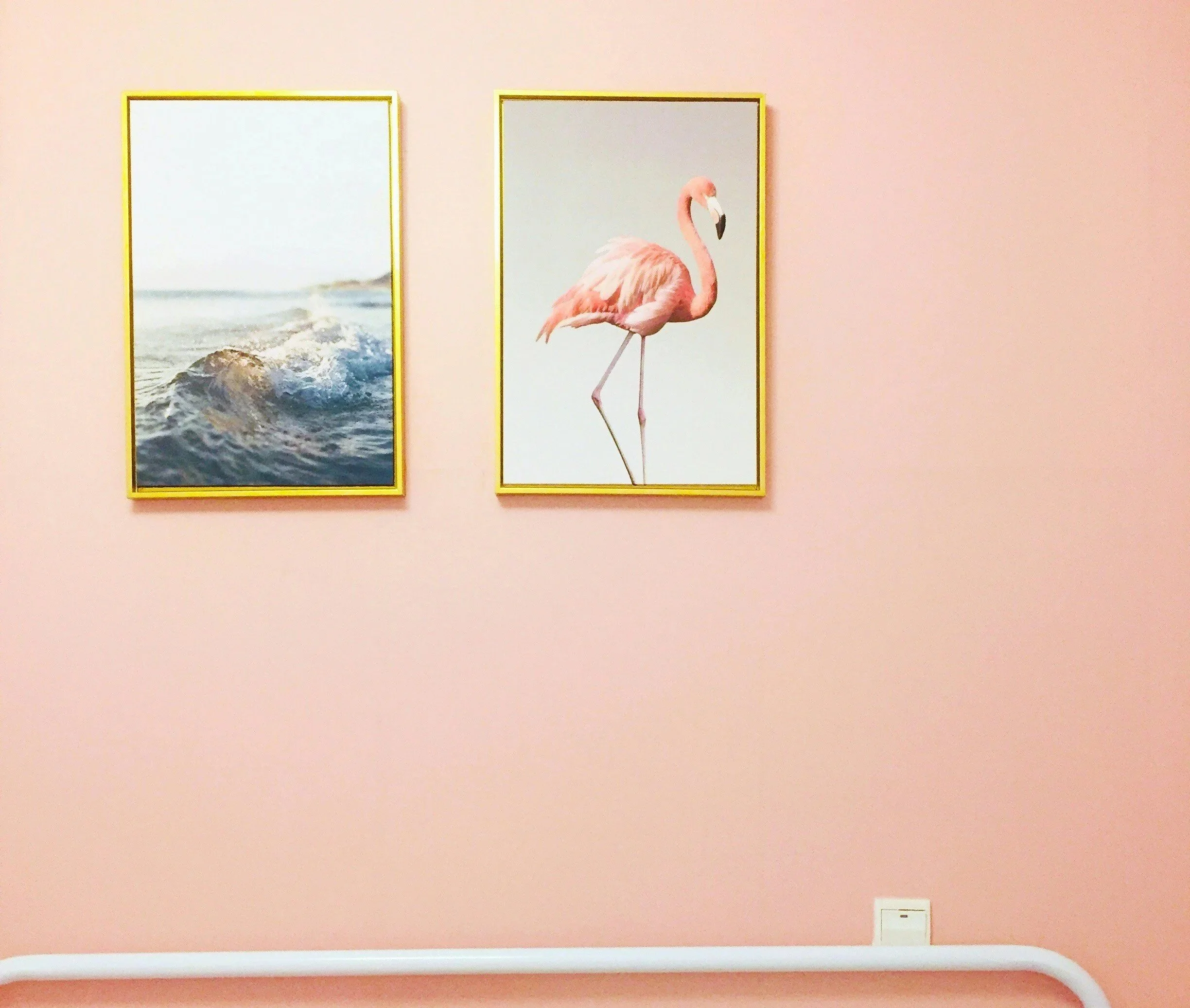
Creating a Cohesive, Gallery-Quality Wall
A well-executed gallery wall allows multiple distinct pieces to communicate and work together. To achieve this, seamlessly mix your pink artwork with subdued neutral prints. This strategy prevents visual fatigue and avoids overwhelming the viewer.
Maintain absolute consistency in your spacing and select frame styles that share a common visual language. You should certainly vary the print sizes, but you must maintain a consistent overall alignment and well-defined exterior borders. Effective, gallery-level wall art placement ensures every individual piece commands attention without crowding its neighbor.
Pink Wall Art for Different Rooms
Living Rooms: Subtle Sophistication
Designers recommend medium to large-scale artwork featuring highly controlled, muted pink tones for the primary living space. Focus your selection on achieving visual balance rather than intense, shocking color. This restraint keeps the living room adaptable, allowing the art to look stunning in bright morning sunlight and elegant under dim evening lamps.
Bedrooms: Warm and Personal Expression
The bedroom demands a calm, restorative environment, making soft pink tones the ideal choice. Select an artwork that deeply reflects your personal interior taste. Serene figurative pieces, soft abstract landscapes, or quiet minimalist prints excel in private sleeping quarters.
Home Offices: Structured Creative Energy
Introduce pink into the workspace in moderate, highly deliberate amounts to maintain absolute mental focus. Structured abstract pieces or sharp graphic styles inject necessary creative energy into the office without causing visual distraction during the workday.
Dining Areas: Unapologetic Statement Appeal
The dining room serves as the perfect arena for visual drama. Utilize darker, wine-colored pink tones and bold, oversized compositions to create immediate, striking contrast. This aggressive curatorial approach thrives in spaces explicitly designed to entertain and make a lasting visual impact.
Choosing the Right Type of Print as a Collector
Open Edition Prints for Accessible Curation
Open edition prints offer incredible flexibility for the modern collector. Studios print these pieces continuously, allowing buyers to explore various artistic styles and scale their collections without paying the premium associated with strict rarity. Crucially, premium studios still produce open editions using heavy, archival-grade materials to guarantee gallery-level quality.
Limited Edition Prints for True Collectibility
Publishers produce limited edition art prints in strictly capped, heavily regulated quantities. The artist frequently signs, dates, and sequentially numbers each piece. This rigid structure adds verifiable scarcity to the work, dramatically increasing its long-term financial and curatorial value within a serious collection.
Hand-Embellished Works for Ultimate Exclusivity
Hand-embellished pieces feature direct, manual additions applied by the artist over the printed image. This physical intervention guarantees that no two prints look exactly alike. These works sit proudly in the space between standard prints and original paintings, offering the perfect acquisition for collectors who demand tactile uniqueness.
Framing and Presentation for Pink Artwork
Frame Styles That Elevate the Art
Always select your frames based on the artwork's specific tonal values.
Matte Black frames add sharp, defining contrast to soft blush pieces.
Natural Walnut or Ash wood beautifully softens the presentation and adds organic warmth.
Brushed Metallic frames introduce subtle, luxurious detail without overwhelming the image.
The frame exists solely to support and elevate the artwork; it must never dominate or distract from the piece itself.
Matting and Glazing Considerations
Acid-free matting creates crucial visual breathing space between the actual artwork and the frame's edge. Crisp, neutral white or warm off-white mats work flawlessly with pink tones, drawing the eye directly into the center of the composition.
Always insist on premium, UV-protective glazing (glass or acrylic). This specialized glazing preserves the delicate pink pigments, preventing irreversible fading and damage caused by prolonged light exposure.
Placement and Lighting for Maximum Impact
Always position your artwork directly at eye level (roughly 57 to 60 inches from the floor to the center of the piece) to ensure optimal viewing clarity. Utilize focused, gallery-style track lighting or dedicated picture lights to brilliantly highlight the artwork's texture and complex color variations. Finally, avoid placing valuable artwork in direct, harsh sunlight to ensure its physical longevity.
Common Mistakes to Avoid with Pink Wall Art
Curating art requires discipline. Avoid these frequent missteps to ensure your space remains elegant:
Buying overly bright or neon pinks instantly destroys the room's carefully calibrated balance.
Pairing pink with incompatible, clashing colors like bright orange or lime green.
Ignoring physical scale, resulting in tiny art floating awkwardly on massive, empty walls.
Purchasing cheap, mass-produced decorative posters instead of investing in meaningful, museum-quality, curated artwork.
Avoiding these specific pitfalls guarantees you maintain a highly cohesive, deeply refined interior space.
Where to Find Pink Wall Art for Grown-Ups
Curated fine art platforms offer vastly superior selection and rigorous quality control compared to chaotic, mass-market decor websites. Premium platforms focus entirely on artist-led work, ensuring museum-grade production standards for every piece shipped.
Edition-based purchasing models help collectors clearly understand exactly what they are investing in. Limited-edition, hand-finished print formats provide the strict structure and absolute clarity required to build a meaningful art collection.
When acquiring wall art online, you must relentlessly focus on material quality, the specific print process, and the artist's professional background. Platforms like Haus of Collectors champion this exact approach. We seamlessly combine a highly curated, expertly selected collection of modern art with collector-focused edition formats, ensuring you acquire pieces that elevate your space and retain their value.
Conclusion
Pink functions as an incredibly versatile, highly structured design element when collectors deploy it correctly. It adapts flawlessly across stark minimalist spaces, heavy, moody environments, and aggressive, bold interiors without ever losing its visual clarity.
Selecting the right artwork fundamentally depends on understanding tone, mastering composition, and executing clear curatorial intent. Collecting art with deliberate purpose always yields significantly better long-term aesthetic results than simply buying brightly colored, disposable pieces to fill an empty wall.
When approached with strategic balance and an eye for premium quality, pink wall art brilliantly supports both high-end interior design and deeply personal expression. To elevate your space with museum-quality prints, explore the curated collections at Haus of Collectors or contact our studio today to find the perfect piece for your walls.
FAQs
-
Focus on tone, composition, and subject matter. Mature pink wall art uses muted shades such as blush, dusty rose, or deep burgundy rather than bright pink. Choose artwork with balanced composition, minimal detailing, or conceptual themes rather than overly decorative patterns.
-
Select pink artwork that aligns with your existing color palette and materials. Neutral-infused pink prints, abstract compositions, and limited edition pieces integrate well with modern interiors. Consistency in tone and framing also helps maintain a cohesive look.
-
Pink wall art can be highly collectible when it is part of curated collections, limited editions, or artist-led works. Collectors often focus on print quality, edition size, and artist credibility rather than color alone.
-
Use pink as a controlled accent rather than the dominant color. Place artwork strategically as a focal point and pair it with neutral tones like beige, grey, or black. Limiting the number of pink elements helps maintain balance.
-
Check print quality, materials, edition type, and artist background. Avoid mass-produced prints without clear sourcing. Platforms that offer curated selections and edition-based artworks provide better long-term value and consistency.