
SHOP THE HAUS
MONOCHROME COLLECTION
Defined through tone, contrast, and a single visual range.
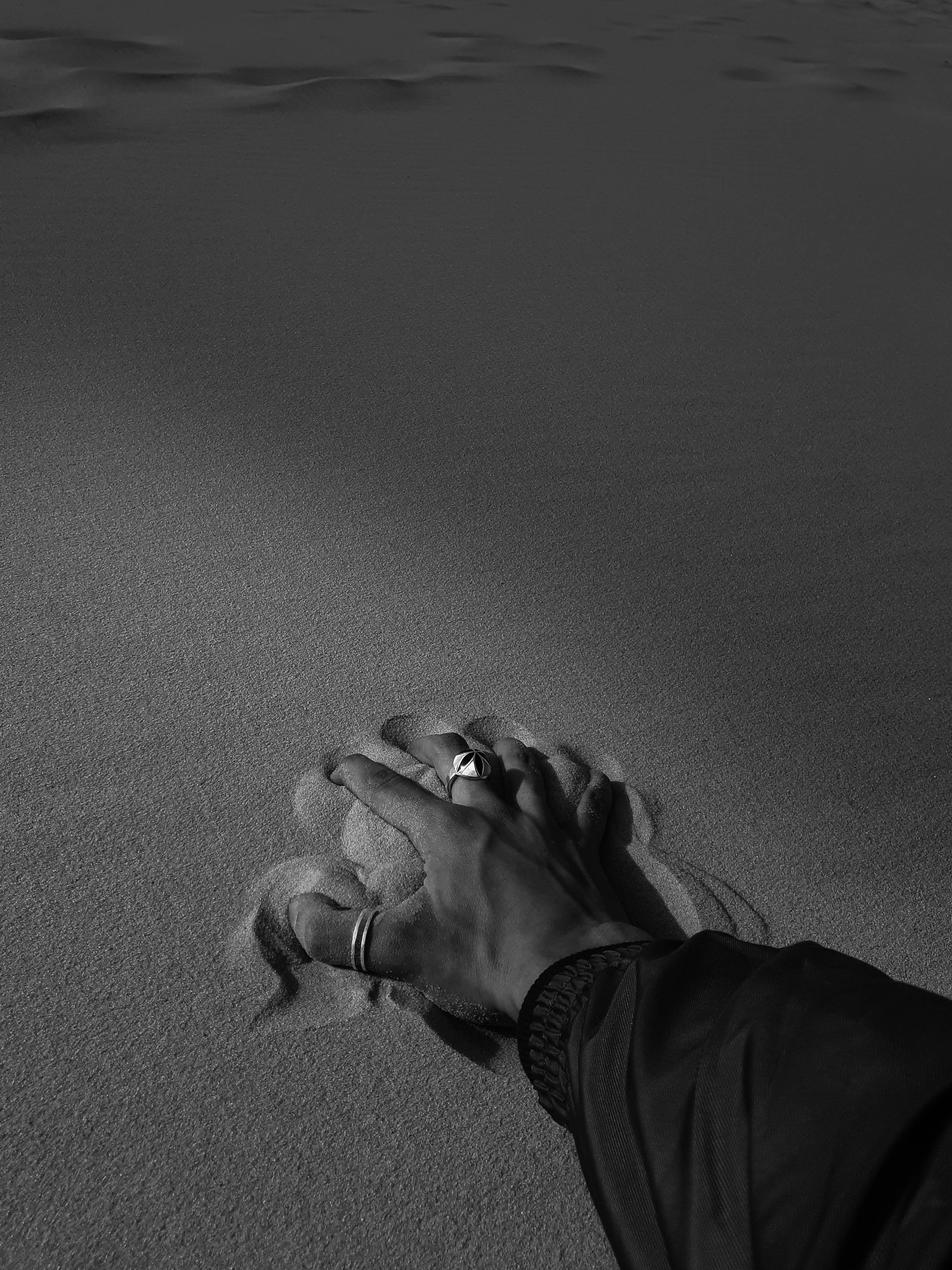
The Monochrome Collection masters a strictly restricted palette. By stripping away color, our artists elevate contrast, structure, and surface detail to the forefront. They shape each composition entirely through precise shifts in light, shadow, and tonal balance, offering a true masterclass in visual restraint.

The Philosophy of the Collection
Here, artists establish visual hierarchy entirely through tonal variation. By precisely adjusting brightness, density, and texture, they create profound depth. Whether weaponizing stark contrast for high drama or whispering through subtle gradations, removing color allows the artwork's true structural genius to command the room.
QUALITY & EDITIONS: Archival Standards
We produce every print in the Nature & Organic Forms category to museum-grade standards, guaranteeing archival permanence for your collection.
The Materials: We exclusively utilize Archival Pigment Inks on heavy-weight, 100% Cotton Rag (Acid-Free) paper. This pairing delivers deep blacks, subtle tonal shifts, and longevity that resists fading for generations.
The Tiers: To support your curation journey, we offer works in three distinct tiers:
Open Edition: An accessible entry point for emerging collectors.
Limited Edition: Numbered and capped quantities that preserve rarity and investment value.
Hand-Embellished: Unique, bespoke prints featuring hand-applied textures or mixed media accents by the studio, bridging the gap between fine art print and original masterpiece.
CURATOR’S GUIDE: Mastering Contrast
When curating monochrome prints for your space, remember that contrast and tonal range dictate how the work interacts with its surroundings. Because color steps aside, the interplay of light and dark becomes the absolute primary factor in the room's visual impact.
High-Contrast Drama: Place deeply contrasted works (stark blacks against bright whites) in well-lit, minimalist spaces to create a bold, modern focal point that immediately draws the eye.
Soft Tonal Integration: Use low-contrast, subtly graded pieces to bring quiet sophistication and visual rest to intimate spaces, such as bedrooms or reading rooms.
Lighting is Everything: Ensure your directional or track lighting highlights the subtle gradients. Poor lighting flattens monochrome art, while precise lighting makes the textures and tonal shifts sing.

FAQs for Monochrome Collection
-
Tonal range can be assessed by counting the number of value levels between the lightest and darkest areas. Works with a broader range tend to show more depth, while those with a narrower range rely on subtle transitions and surface detail.
-
High-contrast works use strong separation between light and dark areas, creating a more defined visual structure. Low-contrast works operate within closer tonal values, resulting in softer transitions and a more gradual visual reading.
-
Without color variation, detail is defined through light, shadow, and texture. This shifts attention to edges, gradients, and surface variation, which become more prominent in shaping the overall composition.
-
Yes. Lighting can influence how tonal differences are perceived. Even, well-distributed light helps reveal contrast and gradation, while uneven lighting may obscure subtle variations.
-
Monochrome works are often used to create visual contrast within a collection. Their placement typically depends on tonal weight and scale, allowing them to either anchor a composition or provide balance alongside more color-intensive works.